Introduction
Product
OSIsoft Technical Support and Online resources.
Challenge
Identifying pain points of finding online content for PI Users through customer interviews and data analysis. Find opportunities to improve the online experience. The goal of the project is to Educate our customers and Enable them to become effective power users who will Empower themselves and the PI community.
My role
Me - UX Researcher
Team - Interaction Designer, Product Lead, Customer Support Group (3), Development Team (3), Information Architect
My Key Responsibilities are to:
Gather insights from user research and data analysis using user interviews, sitemaps, google analytics, and user flows
Identify pain points in the user journey
Create ideal journeys and wireframes based on research results
Translate research into actionable insights for team
Facilitate collaborative discussions involving designers, support team, developers, and site leads
- Communicate needs and findings to executive teams
Identifying the Problem Space
I was approached by the customer support team to work on improving our online resources, which included separate sites. Our first goal was to understand what the current experience was like, what are the opportunities?
Case Analysis
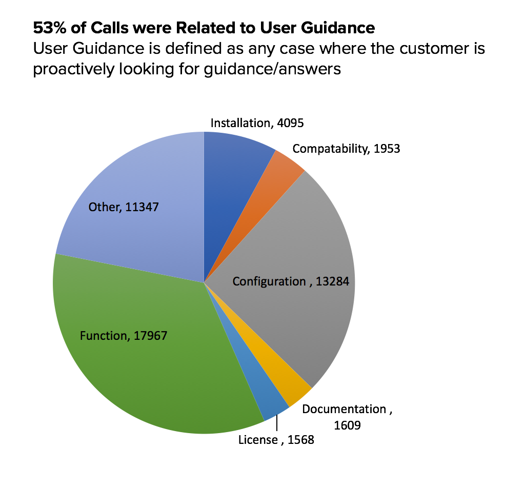
Case analysis was done to see what was troubling our users the most. A startling amount of calls were related to simple guidance.
Reading the Manual
Further case analysis showed that almost 6000 cases were the result of a user needing a user manual in order to resolve their issue. There had to be an easier way for getting useful information.
Analysis of the Current System
An analysis (user surveys, heuristic evaluation) and comparison of our different technical support sites and main corporate site lead to the discovery of the following issues:
- All sites have a different search system and inventory.
- Each site organizes and labels products in a different way, users cannot form a single model of the system.
- Each site is visually different. Various logos, colors and fonts, different layouts, and varying architectures.
- There is minimal overlap of the sites, a user cannot easily go from our technical site to our learning site.
Objectives
- Provide information to manage infrastructure - Reassure and inform users
- Know our customers better - what do they need?
- Reduce unnecessary content
- Strengthen Post-Sale Product Support
- Help users get what they need, when they need it
- Reduce Technical Support Calls
- One Stop Shop
The Journey: Current and Ideal
In order to convey the problems and opportunities to our stakeholders we told a narrative from the perspective of our persona, Nicole. Nicole is not considered a power-user and is likely to rely on our available resources for guidance.
Touchpoints
On the left we show the touchpoints a user must go through in order to find the proper resources for a product. To the right is a simplified, or ideal path for users.
Consolidating the Sites
We started with three different sites and needed to consolidate them into one. We went to customers and did a card-sort to get feedback into how we should organize our sites.
Card Sorting
The card sorting revealed that customers look for information based on product type and then look for resources related to those products. In the current setup this simply was not possible. My next step was to consolidate the content from the other sites into one model.
Strategy
Phase 1: Quick Fixes
- Navigation
- Update Navigation across Libraries
- Content Strategy
- Restructure of Current Software and Support Sections
- Consistency
- Create Consistent Design
Phase 2: Long Term Content/Design strategy
- Content Strategy
- Taxonomy
- Content Categories
- Content Types
- Content Model and Matrix
- Tagging Strategy
- Design Strategy
- Responsive Design
- Navigation
- Templates
- Visual Direction
- Unify Search Strategy
- CMS/Platforms
Consistency
Our recommendation was to unify the branding and styles for the different sites while we worked on the long term strategy. We used the recent re-design of the main technical support as the foundation.
- Consistent visual brand
- Consistent organization
- Provide touchpoints into other existing online resources
Organizing Content
- Content was not organized in an intuitive way. Users did not know where to find resources on learning or documentation
- Users associated "downloads" with product/software downloads
- Created new sections to provide more explicit entry points to learning and documentation resources
Long Term Plan
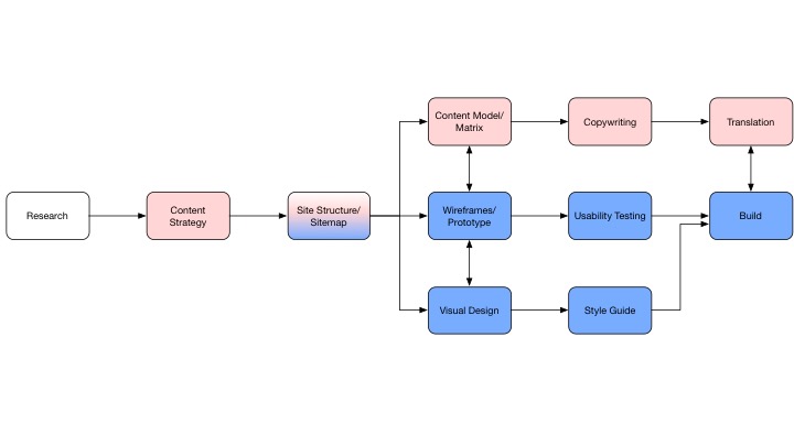
The long term plan involved two parts: design strategy and content strategy.
Content Strategy
When we began work on the sites we needed to know what content we had, where it lived, and who owned it. Each site had been created at a different point in time and with different leads, therefore each site had its own content to manage. This would lead to some issues in which we had content that was duplicated, or worse, outdated. Our goal was to have one CMS and one search that could access all of the available content.
Content Management needed a process and ownership.
We identified all of the different types of contents and their meta-data. We then grouped like content together into different types of buckets, "learning material, product details, new information, blog, etc.". From the earlier research we knew how to organize the site, however we had to prioritize the content for each page. This was accomplished by discussing with internal experts and users. We ranked content with considerations of most requested, visited, and urgency.
Design
Variations of the product details page
Requirements
- Highlight important and relevant information on the Product Page
- Help guide the user to the most important content and tasks
- Organize content based on users' mental model
- Notify user for critical information
Account Page
- Bring the ”one-stop” ideal to users’ accounts
- Allow users to easily access their information
- Provide access to open and closed cases
- Product alerts and releases based on owned products
- In the future – show community posts posted by user Ideally accessed through “welcome, user” link
Search Results Page
- Add filters for pages/searches that contain a lot of content/results
- Provide a way to return to Product Page or change search to another content type (i.e enhancement requests, known issues, etc.)
Landing page for product information.
- Critical information is aggregated at the front page
- product alerts - any information that threatens or radically changes the status of a product.
- brief description and introduction to the products via informational videos.
- Provide information on what the product does and what it needs to function clearly
- Overview of what the product is capable of
- Overview of critical updates and features
- Requirements for product installation
- Important links to:
- download product
- contact support for product issues
- forum for product related topics and discussions
Summary
The redesign of the support sites is an ongoing effort. We transferred ownership to a new team and passed along the long-term strategy. Throughout the project it was important to keep things documented and provide deliverables.
- Gathered all deliverables and strategy steps into a proposal to hand off
- Problem statement
- Objectives
- Persona and touchpoints
- Requirements
- Sitemaps
- Wireframes
- Initial content inventory
Highlights
- Helped write a proposal to our executive team on the need for content strategy and a new Content Management System (CMS)
- Created a space for open dialogue on a central issue that had plagued the company for many years
- Introduced topics such as (1) design strategy and (2) content strategy to our customer success team


